How To Analyse And Select Key Features In IELTS Academic Writing Task 1
Check out the video, or read the description of the process underneath.

Firstly, every IELTS Academic Writing Task 1 question contains some parts that are always the same. A typical question will be presented like this:
You should spend about 20 minutes on this task.
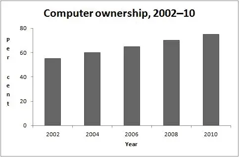
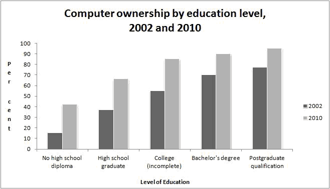
The graphs above give information about computer ownership as a percentage of the population between 2002 and 2010, and by level of education for the years 2002 and 2010.
Summarise the information by selecting and reporting the main features, and make comparisons where relevant.
Write at least 150 words.
Understanding The Question
Three items will always be the same in every question. The instructions 'It is recommended that you spend 20 minutes on this question' and 'write a minimum of 150 words'. You will also always get the same instruction sentence:
'Summarise the information by selecting and reporting the main features, and make comparisons where relevant.'
This sentence is particularly important as it means that we always have to do the same thing in each summary. This is helpful as we can then use the same structure for all of our answers.
The final sentence is the background statement. This tells us about the visual data we will see. This is always different and needs to be studied carefully. Underlining key words is a good idea here.
Make sure you have a clear understanding of this information before moving onto analysing the visual data.
Analysing The Visual Data
The term 'visual data' simply means whatever line graph, pie chart, bar chart, map, or diagram is presented along with the question. In this case the visual data is bar charts and can be seen below:
To first understand the visual data we first need to check the following things:
- What is/are the titles of the visual data?
- What are the labels on the x/y axis?
- Is there a 'key' and what does it tell us?
- Is the information over time or just about one point in time?
- What is the main purpose of the data?
Once we have answered the above questions we are ready to start selecting key information as the question asks.
Selecting Key Features
Essentially, we need to select between 2-4 key features so that we can write an over view of what the visual data shows us.
In order to select key features first go back to thinking what is the main purpose of the visual data. In this case the main purpose is to:
- Show us how levels of computer ownership have changed over time.
- Compare computer ownership levels against different levels of education.
Now, we need to focus on these main purposes and see what are the most obvious things that we can point out. Well, it is clear to see that:
- Computer ownership levels are steadily rising.
- The higher the level of education the higher ownership levels are.
- Computer ownership levels have approximately doubled for non high school diploma students and high school graduates.
It is important we only pick out the most obvious noticeable things and we also do not need any numbers at this stage. It is advisable to make bullet notes of these facts to help us when we write the over view in the second paragraph.
At this stage you should not pick out individual stages, or start comparing individual groups or start describing different stages. This would be too much detail for our overview.
Once we have made these notes we have understood the data and selected our key features, we are ready to move on to writing the opening paragraph.
IELTS Writing Task 1 (Academic)
Discover how to describe all types of visual data that you may see in this part of the test.

Sshhhhh! Listen closely, here are some valuable tips, techniques and strategies for maximising your listening band score.

IELTS Writing Task 1 (General)
Discover how to write in the correct format and tone for this part of the test.

Learn 'what' to say and 'how' to say it in each part of the test to impress the examiner.